A QUT researcher is mapping the G20 Leaders' Summit as it plays out on Twitter to find out how the event is affecting those inside the "barricades".
Mapping the G20 - what does it look like?
•Mega-event Twitter study from inside the declared areas.
•#ColourMeBrisbane - kaleidoscope of the hashtag so far.
•G20 Hypometer - discover the most tweeted-about G20 countries.
In a first for any G20 event, the blue-sky big-data research project is mining and analysing tweets sent from inside the declared areas for location-based information.
Dr Peta Mitchell is then plotting those - minus the corresponding usernames - on an interactive map the public can explore via a website.
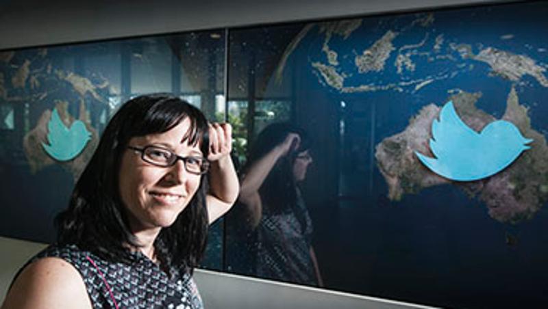
"No project has mapped G20 social media data in this way before, so we don't really know what kind of information we'll glean - or even how many tweets to expect each day from within the declared areas," said Dr Mitchell, who is leading the project for QUT's Social Media Research Group (SMRG) within the Creative Industries Faculty.
"I'm expecting to collect things like people's reactions to the various G20 cultural activities, their opinions on traffic and public transport disruptions, political commentary as well as celebrity-spotting.
"Mapping tweets to specific locations is problematic because only 1-3 per cent of Twitter users turn on their location services feature, which means I'll need to look at the content of each tweet to glean information about where that user was standing when they sent it."
Dr Mitchell is using a process known as geoparsing to sift through potentially thousands of non-geotagged tweets per day, honing in on mentions of streets or landmarks within the declared areas, and assigning geographic coordinates to them.
She is also tracking delegates' tweets and existing and emerging G20-related hashtags, such as #G20, #OnMyAgenda, #ColourMeBrisbane, #G20Cultural and #WalkingG20.
The SMRG, based in QUT's Creative Industries Faculty, has already identified more than 180,000 G20-related tweets globally in the past two months.
Dr Mitchell said her big data mining and mapping project will provide a test bed for future large-scale events.
"From a pure research point of view, I want to know how a disruptive event like the G20 affects people's mobility, and how it changes their perspective of Brisbane.
"Brisbane City Council has set clear aspirations for being: an accessible, connected city; a friendly, safe city; and a New World City. The G20 is an extremely prestigious event that may put those aspirations at odds with each other.
"Understanding how people use social media to talk about the disruptions that big events cause in their daily lives is very useful for organisations involved in planning large events - governments, emergency services departments, transport authorities, event organisers and even insurance underwriters," Dr Mitchell said.
"This project is also a good way for the residents of Brisbane to get involved with the G20 even if they don't want to be physically close to the city centre while it's on.
"They can access the interactive map and see at a glance the emerging patterns and clusters of Twitter activity, and the content of the tweets, although not who their authors are."
The interactive map of G20 tweets will be available to the public from Monday November 13 on the SMRG website and will be added to throughout the week.
Visitors to the site can also watch the SMRG's G20 Hypometer, which tracks the G20 countries people are most tweeting about.
Media contact:
Kate Haggman, QUT Media, 07 3138 0358, kate.haggman@qut.edu.au
After hours Rose Trapnell, QUT Media team leader 0407 585 901


